Why We Print Spot Colours on White or Light Ribbons
When ordering custom printed ribbon, one of the first decisions you’ll make is choosing the ribbon colour. While dark ribbons such as black, navy, burgundy and forest green can look stunning, they aren’t always the best choice for multi-colour spot printing.
If your logo contains several solid spot colours or includes lighter colours, printing on a white or light-coloured ribbon will usually produce a brighter, cleaner and more accurate result.
Here’s why.
What is Spot Colour Printing?
Spot colour printing is a process where each colour in your design is printed separately using its own specially mixed ink.
Unlike full-colour digital printing, which blends tiny dots of colour together, spot printing applies each colour individually to create crisp, solid areas of colour.
This method is ideal for:
Company logos
Brand colours
Corporate ribbon
Promotional ribbon
Luxury packaging ribbon
Because each colour is printed separately, the colour underneath becomes very important.
Why White Ribbon Produces the Best Results
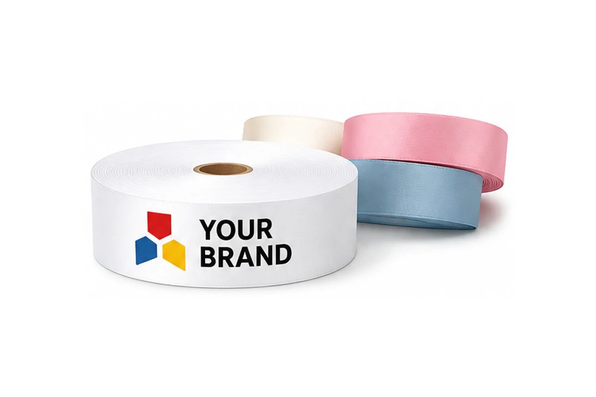
Think of white ribbon as a blank sheet of paper. Every ink colour sits on a clean, bright surface, allowing it to appear exactly as intended.
Colours printed on white ribbon are:
- Bright and vibrant
- More accurate to your brand colours
- Cleaner and sharper
- Easier to reproduce consistently
White ribbon provides the highest contrast, making every colour stand out.

What Happens on Dark Ribbons?
A dark ribbon acts more like coloured paper.
Instead of reflecting light, the darker background absorbs some of the light, changing the way printed colours appear.
Lighter colours such as:
- Yellow
- Pink
- Light blue
- Orange
- Lime green
can lose their brightness and appear duller than expected.
In some cases, the darker ribbon colour can subtly influence the printed ink, making colours look slightly different from the original artwork.
Multi-Colour Logos Need a Neutral Background
If your logo contains several different colours, every one of those colours needs to remain distinct.
On a white ribbon Reds stay bright, blues remain vibrant, greens keep their richness and yellows remain clean and visible.
On a dark ribbon, lighter colours often lose contrast, reducing the overall impact of the design.
The more colours your logo contains, the more noticeable this difference becomes.
Which Ribbon Colours Work Best?
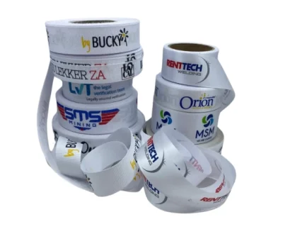 For multi-colour spot printing, we recommend printing on our polyester satin or Petersham ribbon in these colours:
- White
- light cream (p)
- Ivory
- Light pink
- Light blue
- Champagne
These colours provide an excellent base for vibrant printing while allowing your artwork to reproduce as accurately as possible.
Can We Print on Dark Ribbons?
Absolutely.
Dark ribbons are often an excellent choice when your design uses:
-
One ink colour (screen-print)
-
Metallic gold or silver foil (foil print)
- White printing
-
Bold logos (dye-sublimation)
-
These combinations create striking, high-contrast results that look elegant and professional.